This is a test post.
This is a test post.
Documenting My Journey With Stamps
This is a test post.
Almost a year. Almost a year since my last article. I've been busy! Should I feel guilty? I don't think so, it is my pet fun project after all. Life has been very busy and my stamps are now splitting time with collecting records and CDs,
Wow...3 months have flown by. No articles for 3 months...I've been busy. Part of the delay however was that I discovered after beginning this article that it was going to be a completely different article than I had originally intended...you'll see why below.
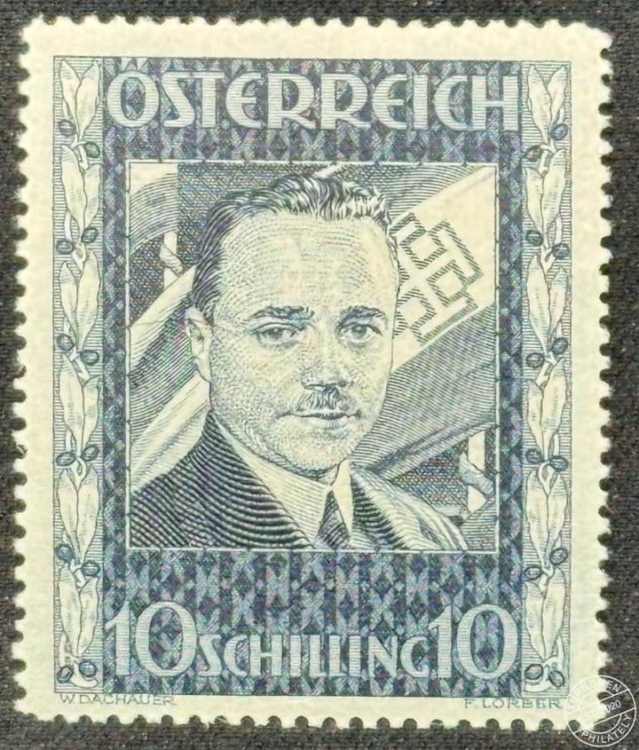
Mike at the Feature Philately YouTube channel reached out to me and suggested doing a research swap. He is a specialist in Bulgarian items, so he sent me a large packet of Bulgarian material, and I sent him some interesting Austrian stuff. He will be releasing a video on his
As a few of you might have noticed, I haven't updated the Turngren Philately Twitter account in a while, and that's because I've been spending a lot of time on Mastodon. I'll probably be locking or deleting the Twitter account soon. Twitter